How To Design A Sign - Sign Design Tips


How To Design A Sign
Contents
Secret #1: What Should Your Sign Say?
Secret #2: How Should Your Particular Message Be Designed on Your Sign
Secret #3: Are ALL CAPITAL LETTERS Easier to Read?
Secret #4: Secrets to P O W E R K E R N I N G.
Secret #5: What Are The Best Color Combinations To Use?
Secret #6: How Do You Make Your Sign Visually Interesting?
Secret #7: How Do Graphics Add Impact?
Secret #8: A Simple Technique to Increase the Reading Speed of Your Sign by 26%?
Secret #9: Which Sign Shape is Right For You?
Secret #10: How Big is Big Enough?
Secret #11: How to Turn Negative Space Into A Positive Design Element.
Secret #12: Make Sure Your Sign Doesn't Get Lost In Its Surroundings.
Introduction
Is Your Signage Missing These Critical Components That Grab Customers Off The Street?
Do you really understand why some custom signs get your attention while others remain almost invisible? How much business will you continue to lose if your signage fails to get noticed or spark consumer interest? Not knowing these simple, yet profoundly important principles may very well be costing you more ongoing business than you realize.
You are about to discover the secrets of "How to Design a Sign". And then how you can use this knowledge to dramatically enhance the effectiveness of all your new custom signs, banners, vehicle graphics and more!
Since Signage Is Such A Strategic Investment In Your Business, Where's The Best Place To Start?
Ironically, one of the critical steps to how to design a sign has little to do with the design itself! Perhaps that's why it's overlooked by so many people. A great design starts with the right plan. And with the help of this guide, you'll quickly glide through the process in a matter of minutes with a greater sense of clarity and purpose than ever before.
So let's get you started out on the right foot with the core secret of how to design a sign!
What Is The Core Purpose Of Your New Signage?
When one of my closest friends asked me what kind of sign I recommended for his new business, I couldn't tell him! At least, not at first. Why not though? After all, I've been in the sign industry for over 20 years. Surely I should know how to design a sign buy now, right?
The reason I couldn't give him a recommendation is because I needed to find out the answers to certain questions, first. Once I got his answers to a few specific questions, everything fell right into place. The type of sign and design he needed became clear.
Since I'm not right there with you to ask you these questions, you can ask them for yourself. Asking yourself these questions will reveal the core purpose and objectives of your new signage. So what do I mean exactly by "core purpose and objectives"?
What do you want your sign to do for you?
Simple question, eh? But when you think about the answer, your focus will be razor sharp. And with a focused objective in mind, your message will be even more effective.
Businesses, Government, Hospitals, Schools, Charities, Churches and other organizations have a variety of needs for signage. While a private business may need new signs with the specific purpose in mind of attracting new customers, a school may want a bright, colorful banner for their soccer team. Needs and goals vary widely. These key questions will help you focus on your own goals and objectives.
Whose Attention Are You Trying To Attract?
- Who is your target audience?
- Is your message aimed at potential customers,
existing clients, employees, visitors, students,
members, residents, patients, guests, suppliers,
investors, shoppers or passing motorists?
What Is The Primary Purpose Of Your New Signage?
- To Advertise?
- Identify?
- Sell?
- Warn?
- Inform?
- Inspire?
- Direct?
- Or Impress?
What Do You Want Your Sign To Do For You?
- Does your sign need to be eye-catching to attract new customers off the street?
- Are you having a special promotion, event or seasonal sale?
- Do you want to design a sign to impress your clients with a professional, high-end corporate appearance?
- Are you meeting government regulatory requirements for certain types of signage? For example, "Fire Exit", "Pool Safety Rules", etc.
- Do you need to identify your building with signage to make it easier for people to find you?
- Do you want to create greater name recognition and exposure in your local market?
- Are you trying to make people aware of a cause that is important to your organization?
- Do you want to prompt impulse purchases?
- Are you trying to protect people from accidents?
- Do you need directional signs for visitors?
- Does the sign need to inform or educate readers?
- Is the sign needed to help prevent injuries and reduce liability?
If you were to write out the objectives for your new signage, it might look something like this:
- Target Audience
Potential customers driving by in front of our store - Core Purpose
To attract their attention and create interest in our products - Secondary Goal
I want to design a sign to brand our business with a distinctive appearance that will make us stand out from our competitors and neighboring businesses.
With your core purpose in mind, determining what you want to say with your signs becomes a bit easier.
Return to Contents
DESIGN SECRET #1
What Should Your Sign Say?
Words are one of the most important design elements in signage.
The curvy shapes and lines of each letter create word forms which utilize valuable space in the design. And yet, we don't typically think of words as being a "design element" at all.
As a consequence, one of the most common design mistakes in creating a sign we see is bad wording. There's often a hodgepodge of ideas randomly tossed together in an attempt to create an effective marketing message. Could this be due to overlooking Step #1?
When you carefully choose the words which correspond with your sign's primary purpose, your message will be clear and precise.
Here Are Three Important Concepts To Help You Stay On The Right Track:
- You only have 3½ seconds! Seriously!
Signs viewed by passing motorists often have a lifespan of just 3½ seconds before the vehicle whizzes right on by. Overcrowding your sign with too many words or lines of text can make your message too difficult to read. Plus, too much information can make the sign look so busy, people won't take the time to read it. It's just too much effort! - Less Is More
The most successful sign design will communicate clearly and concisely. Therefore, in as few words as possible(seven or less), create the message you wish to convey to your target audience. The number of words used on a sign is a classic example of where "Less Really Is More". This all seems so obvious, doesn't it? And yet I'm bringing this issue to your full attention — "just in case" — because overcrowding signs with too many words is still such a common problem. - Don't leave anything to chance
A potential client called me the other day wanting a price for a new business sign. The only thing he wanted on the sign was a single word —Zaffron's

Now if you were to guess what kind of product or service this business offers, what would you say?
You have no idea right? Neither did I, until I asked.
Why Fight An Uphill Battle With An Unclear Message?
(You would be surprised how often this comes up in our business — that's why I'm bringing it up!)
So make sure people can tell the type of business you're in from your sign design. Otherwise, you'll miss key opportunities to attract the attention of potential clients who are in the market for your products and/or services.
If you currently have a business name that doesn't make it apparent what you do or offer, you can always add a descriptive word or phrase that'll do the job. For example, Zaffron's Bakery.

If you have questions or would like some help wording your message, just ask for one of our "Sign Specialists".
Return to Contents
DESIGN SECRET #2
How should your particular message be designed on your sign?
Your sign gives you the opportunity to "speak" to your audience with a distinctive voice all your own. By selecting a distinctive typestyle that's appropriate for your organization, you can create and reinforce brand recognition in your local community.
Here are a couple of examples:

Notice a pattern? Two letter styles, two colors
The distinctive letter styles of each restaurant convey a completely different look and feel.
Wild Wing Café appeals to the young (and young at heart), "hip crowd" looking for a lively dining experience. While Moe's triggers an appetite for those of us who love the intense, fresh flavors and aromas of an authentic southwest grill. (Can you pass the salsa please?)
DID YOU KNOW?
All fonts and typefaces are the same price
How do you select an appropriate typeface for your project?
All typefaces give the reader a certain feeling.
Your audience may not consciously notice the typeface. But they will be subconsciously influenced by the style, delivery, and personality of your message. If you think of typefaces as a theme representing you and/or your business, then you're on the right track.
Even BLOCK LETTERS come in hundreds of shapes and styles to fit any occasion.
Typefaces (also known as fonts) can be broadly characterized in two categories:
- Friendly, warm and casual
- Or formal, serious and traditional.
Some fonts can manage to be both formal and casual, depending on how they are used. And there are degrees of both formality and informality.
It's just a matter of selecting a font or theme that's appropriate for your particular message and organization. Here's an example.
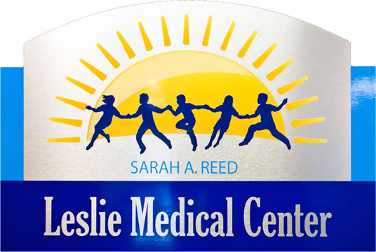
If you were opening a family medical center you might design something like this:

Now look at the difference in the sign by changing the font! It no longer has the same feel. It no longer projects the image of a clean, professional medical environment.

See how a simple change in the font makes such a huge difference in the perception of the message? Parents would probably think twice before they signed their children up for this doctor!
What are the three most common font mistakes?
In an attempt to stand out in the crowd, inappropriate fonts and text effects are often chosen for signage. "Designer Fonts" may look good on business cards and stationery, but they can greatly diminish the effectiveness of a sign. To make matters worse, fancy type styles are sometimes still used completely wrong.
Mistake #1

Script style fonts can be difficult, if not impossible to read from a distance. Here are some other common examples of fonts with poor legibility. Only use these fonts when you need to convey a message a certain way. And the reader will be up close.

Mistake #2
We sometimes see signs that look like a train wreck!
![]()
Which says, "ALL UPPER CASE SCRIPT". What a disaster!

Even though avoiding these mistakes seems like "common sense", it's not so common to well-meaning people who just haven't learned any better yet...until now.
Mistake #3
The wrong text effect can ruin an otherwise perfectly good font. Here's a side-by-side example of the difference.
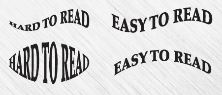
How do you select an appropriate typeface for your project?
All typefaces give the reader a certain feeling so select a font that displays the image and style you want to convey to your audience.
Which letter styles are the easiest to read from a distance?
Sans Serif fonts project a strong durable image. They also effectively communicate quick bursts of information.
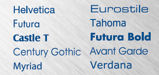
Serif Style fonts shown below project a more sophisticated upscale image. They also make it easier to read large bodies of text.
Serifs are short horizontal lines added to the tops and bottoms of traditional typefaces, such as "Times New Roman" seen below.

Please note the differences above between the block style letter (sans-serif or "without serifs") and the serif style letter.
There are several variations of similar looking serif type styles including:
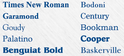
Each letter style has its own unique, defining characteristics. The distinctions from one serif letter style to the next are often subtle.
If you look at what national companies do with their signage, you will notice clear, easy to read text in almost every case.
Typefaces: The Unofficial Rules To Live By
- As a general rule of thumb, don't use more than two different letter styles in a single sign design. Otherwise, you risk creating a mish-mash of fonts and reducing the effectiveness of your message.
- Make your primary message stand out. And it doesn't always have to be the name of your business that stands out the most. It depends on what you want your sign to do for you.
- Get a second opinion. A fresh pair of eyes can offer a different perspective. Whether it's the graphic designer you�re working with or a friend, ask them for their point of view. And then decide what you want. After all, it's your sign!
Once you know the core message, you probably have a pretty good idea of the look that you want. A law office doesn't want something that looks like a day care center. And a day care wants to look fun and exciting, not serious and silent.
Articulating the look you want is not always easy for our customers. So we have put together some examples of the looks and how they could be used to help you decide on the overall look before we begin working through other design elements. Keep your core message in the back of your mind when deciding on the look of your sign.
Professional
People tend to think of lawyers, doctors, and businesses along those lines when they hear the word professional

Conservative
Steeped in tradition, tend to have traditional values, "straight-laced"

Classic
Formal refined and restrained

Retro
A look distinctive to a time period.

Whimsical
Full of fun, doesn't take things too seriously

Kidsy
The look and feel of childhood, bright colors and childlike print

This is a small selection of fonts to help you brainstorm about the image you want to project. Using the right font can make the difference in how your sign is accepted. Each font has its own feel and choosing the right one is important.
Return to Contents
DESIGN SECRET #3
Are ALL CAPITAL LETTERS easier to read?
There is a misconception that exists that since ALL CAPITAL LETTERS are "bigger" than their lowercase counterparts, that they must be easier to read from a distance.
However, visual tests have scientifically verified that Upper and Lower Case Text is more legible from a distance than ALL UPPER CASE LETTERS. That's because it's easier for our brains to distinguish the shapes of upper and lower case text verses all capital letters.
Since passing motorists may only have 2-3 seconds to read your message, maximize the readability of your custom designed sign by limiting the use of all capital letters.
ALL CAPS do have a place in effective sign design. However, since you now know this secret, you will automatically be mindful if and/or when you choose to use them. When you preview your new sign design, stand back from the monitor to get a better idea of what the text will look like from a distance.
Return to Contents
DESIGN SECRET #4
Secrets To: P o w e r K e r n i n g
Kerning may be a rather unfamiliar word to you now, but its application will help unify your new sign design.
Kerning is the process of adjusting the spacing between letters. The human eye is quick to notice breaks in regular patterns. When there is too much or too little space between characters within a word, the reader's eye stumbles.
By adjusting the letter spacing, you can increase or decrease the space between characters to ensure the smooth flow of information from the text to the reader's brain. Proper kerning brings the individual characters of a word together into a single unit.
Even though design programs automatically address most of the kerning issues, there are many instances when a user must adjust kerning manually.
For instance, a typeface may have automatic kerning pairs for the characters "Yo", such that the lowercase letter o tucks under the arm of the uppercase Y. Here are letter pair examples with known kerning issues.
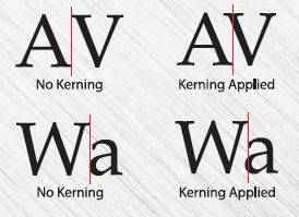
With most fonts, uppercase characters are spaced so they fit best when lowercase letters follow them because that is how they are normally used. So words set in all uppercase letters may be poorly spaced between characters.
Large headline text may also require spacing adjustment in order to achieve visual consistency.
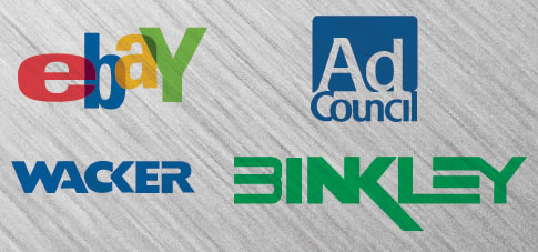
Just below is an example of Power Kerning. The letters are intentionally s p a c e d o u t f o r e f f e c t.

And here are some examples of Over Kerning for effect. You can actually create your own distinctive, stylized logo type with this design trick.
Return to Contents
DESIGN SECRET #5
What are the best color combinations to use?
The use of color is vital to the effectiveness of a sign.
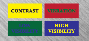
So how exactly, do you use color effectively? The key is contrast. So what exactly is contrast? Contrast is the difference in brightness between the light and dark areas present in a single design.
A bright yellow background, for example, will contrast well with dark letters such as black, a dark shade of blue and even purple. The greater the contrast or difference between the light and the dark colors, the more legible text is from a distance.
Colors that are closer together such as a medium gray letter against a black background won't contrast as well and therefore will be more difficult to read.

Contrast:
Take a look at the above illustration. Which of the two looks larger...the white one? They are both exactly the same size.
The use of a light colored letter against a dark background makes it seem larger. Light letters tend to come at you, whereas dark colors tend to recede.
Generally speaking, white as a background color is by far the most versatile because more colors naturally contrast better against a neutral white background than any other single color.
When you choose a background color for a custom sign other than white, you limit your choices for colors that will both stand out and "go with" that background color. That's not a good thing or a bad thing - it's just something to keep in mind when making color selections.
Comparing Visibility of Different Color Combinations
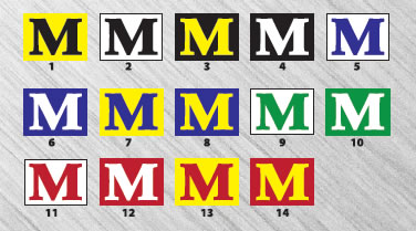
These 14 color combinations for lettering were tested for readability at a distance. The tests were carried out on different groups under the sponsorship of the Outdoor Advertising Association of America (OAAA).
The results ranked in the sequence shown, with #1 the most legible and #14 as the least legible.
Color Combination Effects
Return to Contents
DESIGN SECRET #6
How do you make your sign visually interesting?
Contrast is one of the easiest design principles to grasp. After all, it's easy to see how two objects are different.
Just be careful: you don't want everything in your design to contrast (stand out). Viewers won't be able to decide what's important if everything is contrasting. And that can distract from a message.
Essentially, contrast creates visual interest by placing two different objects next to one another. How can you create more visual interest? There are a lot of ways by varying;
- Size
- Fonts
- Emphasis
- Color
- Value
- Shape
One Logo, Many Looks
I have created an imaginary business for our discussion of design principles. It's a team of certified financial advisors. To the right is the beginning of a logo for The Professional Group with examples to show how you can build contrast into your designs.

The Professional Group presented in Standard Block. Pretty boring, huh?

I've introduced contrast via size in the design above. I've made the most important word, Professional, the largest.

Contrast by typography. Now we've added Times Square, a serif font, to the Standard Block, sans serif font.

Above is an example of contrast by emphasis. Now "the" and "group" are in italics. Contrast can be as simple as having one part of a title in a regular font, and one part in a bold or italics font.

Now here's an example of contrasting colors. Except that these colors don't really differ all that much, do they? Because the words "the" and "group" are small and italic, the black text appears almost gray. Both the blue and the gray are fairly similar in color. You know there are two colors in the logo above, but it is almost hard to tell that it's blue and black.

Just above is an example of contrast by value. All of the words are in the same blue color, but the value of the blue color is lighter in the words "the" and "group" than in the word "Professional". Once again I've made the important word in this logo – "Professional" – stand out by making it a darker value. You want to emphasize the important points.

There's no doubt that the blue and green above contrast. Not only do they contrast in color, they contrast in feeling, too. Blue is a cool color and green is a fresh color.
I think that there's little doubt that the final logo is more interesting than the original logo, even though it's not really a finished logo. Contrast is what makes it a visually stimulating design.


Before & After: With just a few simple changes, there is a dramatic shift in the style, feeling and appearance of the text. Instead of plain, ordinary and boring, there is visual interest and a corporate look and feel to the design.
Return to Contents
DESIGN SECRET #7
How do graphics add impact?
Not every sign needs graphics. For example, this type of sign with text only can quickly build awareness with thousands of views per day!
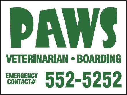
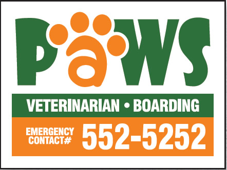
Better
According to the Pennsylvania College of Optometry, a graphic not only adds visual interest, an extra color improves reader retention by 78%.
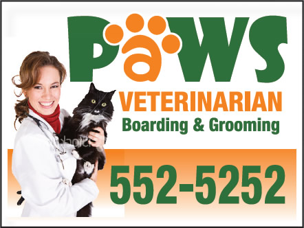
Best with Photo
Full color graphics create the highest awareness of all sign categories. The use of a photo creates 300% greater recall than signs without photos.
Return to Contents
DESIGN SECRET #8
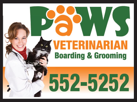
A simple technique to increase the reading speed of your sign by 26%
Adding a border increases reading speed by 26%. Borders are often recommended whenever automobile traffic is the intended audience. A border regulates the reading space and brings focus directly to the center of the sign.
Return to Contents
DESIGN SECRET #9
Which sign shape is right for you?
The three most common shapes for signs include:
- Horizontal rectangle
- A vertical rectangle
- And a perfect square.
Of course, there are a variety of other shapes like circles and ovals that are available but in the interest of efficiency, let's just deal with the most common shapes for now.
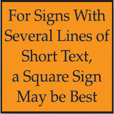

Return to Contents
DESIGN SECRET #10
How big should your letters be?
When it comes to choosing sizes, most people seem a bit lost. I can see it in their faces. They just don't know how to go about it mathematically. So they take their best guess and hope the sign will turn out okay.
However, hope is not a strategy.
Here's a strategy you can use right now to properly size your new signage
Think backward! That's right. If you want to size your new signage properly, it should be "reverse engineered". Don't worry, it's easy to do, once you learn this simple secret.
The secret is to size your letters first BEFORE you size your sign
After all, people don't read signs. They read the words displayed on signs. But only if the words are easy enough to read at a glance. If the letters are too small or too difficult to read, most people just won't bother.
So focus on choosing the size of your lettering, first. And then fit the sign to the size of the letters.

"Size the letters first..."
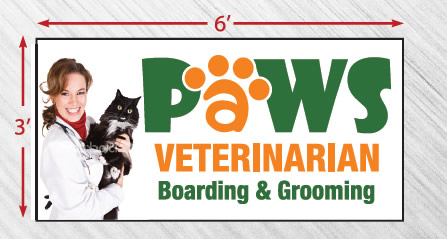
"And then see what size the sign should be..."
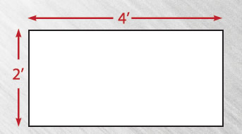
"Instead of guessing what size the sign should be..."
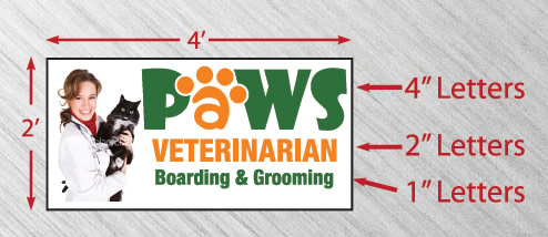
"And then force fitting the letters to fit within the edges of the sign"
Which factors determine how big the letters should be?
There are two primary factors that determine what size the letters should be. Of course, there are important secondary factors to consider too. And you'll have the opportunity to learn about those in our advanced guide.
But to keep things simple and on point, here are the two primary factors:
- Distance
- And speed (for signs to be viewed by passing motorists).
First, you need to know the viewing distance.
The viewing distance equals how far away you want your sign to be readable. Yes, I know it may take you a few minutes to determine the distance. But guessing is outright gambling. And there's no point in taking an unnecessary risk here.
Once you know the distance, we have a new type of calculator you can use. Specifically, it's a Letter Sizing Calculator. (Another handy tool thanks to our computer wizard!)
This Letter Sizing Calculator is based on a joint research project regarding letter visibility by:
- The Pennsylvania Transportation Institute
- Penn State University
- And the United States Sign Council (USSC)
In other words, there's no need to guess at sizes anymore!
The Letter Sizing Calculator simplifies the math for you
Here's an example. Let's suppose you need a new sign for your business. And you are going to be placing this sign directly on the building. How far away do you want potential clients to be able to read your message?
For this example, let's assume you need the sign to be readable at least 60' away. The Letter Sizing Calculator will automatically show you 2 sizes:
- The minimum size the letters have to be to be readable
- Plus the size recommended for optimal visibility.
In this case, the minimum readable size is a 3" tall letter. And the size recommended for optimal visibility is a 6" tall letter. (For added advertising impact, businesses often go even larger!)
This is the first Letter Sizing Calculator

Click here to calculate your text size
All you do is put in the viewing distance. And the calculator will automatically show you how big your letters should be.
The speed of oncoming traffic is another factor that affects letter size
So here's another example. Let's suppose the speed limit on your street is 45 MPH. And you want your message to be readable for 3 full seconds by passing motorists.
A car traveling at 45 MPH for 3 seconds equals a viewing distance of 198 feet. Again, the Letter Sizing Calculator will automatically give me 2 sizes:
- The minimum size the letters have to be to be readable
- Plus the size recommended for optimal visibility.
In this case, the minimum readable size is a 6" tall letter. And the size recommended for easy readability is a 19" tall letter
Here's another Letter Sizing Calculator which takes speed into account

Click here to calculate your text size
All you do is choose the Speed Limit on your road. Plus, how many seconds of visibility you want. And the Letter Sizing Calculator will do all of the math for you!
How far can you read a 4" tall letter?
Or any other size letter for that matter? To find out the answer, just select the size from the drop-down list below. This third version of our Letter Sizing Calculator will show you 2 things:
- The maximum readable distance of that letter
- And the size recommended for easy readability.

Click here to calculate your text size
How do you use this letter-size information to design your sign?
For the main text, consider using the size recommended for easy readability. (Or larger). And then you can go as low as the smallest size recommended for the rest. It's all according to the purpose of the sign. And what you want it to look like.
Our SignMagic Online Design Center shows sizes, automatically.
Or we can create a design for you based on your size requirements, complimentary.
The illustration below simulates the readability of specific size characters from 100 feet away. And then how that compares relative to 200, 300 and 400 feet away.
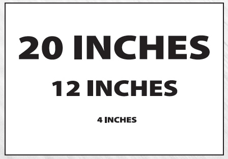
Viewed 100 Feet Away

Viewed 200 Feet Away

Viewed 300 Feet Away

Viewed 400 Feet Away
Return to Contents
DESIGN SECRET #11
How to turn negative space into a positive design element
"White space," also known as "negative space," simply refers to the empty area of a design that is devoid of any text or graphics. The empty spaces surrounding text and graphics are just as important as other design considerations. There is a tendency to "fill up" the available area with as much as possible.

Example of a design that's just a little too crowded to the edge.
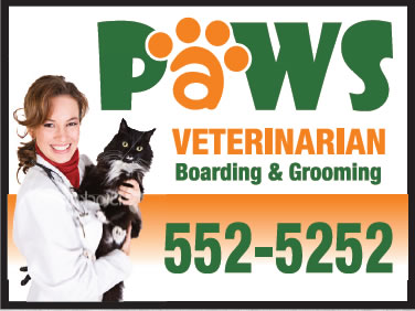
If you downsize the text and graphics, the sign looks less crowded. As you can see though, the smaller size has less impact.
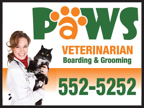
Making the sign just a little bigger preserves the impact of your message without overcrowding the design.
So why is white space so important to create highly effective sign design? Part of the reason is psychological and part of it is physical. Text without adequate white space leaves us feeling crowded and cramped.
Text needs room to breathe.
When text is crowded, the message becomes too difficult to read.
Quick Tip: Once you complete a design, stand back and look at it on your monitor. If a design looks too crowded, it probably is.
Depending on available space and the way you are using your signage, it may not be practical to use all 12 of these design techniques. If you need any help, just give us a call and one of our graphic designers will work one-on-one with you.
We hope this adventure through these secrets of effective sign design has been educational and enjoyable for you. You are now armed with the essentials to making the best choices, allowing you to get the right sign for your needs.
Return to Contents
DESIGN SECRET #12
Make sure your sign doesn't get lost in its surroundings.
Almost as important as great design, is great sign placement. It's easy to get caught up in designing a beautiful outdoor advertisement, only to discover your soft blue blends in with the sky behind it, leaving your message misunderstood and often times, completely unseen.
When creating your sign design, you must consider not only the internal design elements we have discussed in this book, but you must also consider external factors(the environment your sign will be placed in) as well. External factors can include things such as the color of the wall your sign will be mounted to and the color of all other surroundings.
Obviously, colors play a key role in sign design. It is important to be aware that you may need to consider altering or softening your business's existing color scheme if it happens to be inappropriate, too harsh or too soft for its environment. Take the image to the right, for example.
While the sign itself is well designed and has beautiful contrast on its own, the sign nearly disappears when mounted on this light colored brick wall. And while using earth tones in the design of a sign for a Bed & Breakfast in the mountains makes sense, in theory, such a sign may easily be camouflaged when displayed along the tree-lined, early path that leads your customers to your establishment.
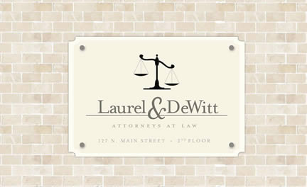
The light creams and grays of this sign blend in with the light colored brick of the building.
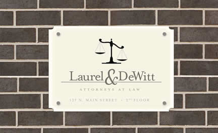
Placing the sign on a building with darker bricks helps create contrast so the sign really pops,
making the message clear and easy to read.
Return to Contents
DESIGN SECRET #13
What is the "Optical Center" of My Sign Design?
Our final ingredient to highly effective business signs is understanding the concept of the "Optical Center." The optical center is the spot where the human eye tends to enter a page or design. Normally, our vision gravitates toward an area on the page slightly above the mathematical center. While the mathematical center is, of course, 50% down from the top of a page or design, the optical center falls around 46% down from the top of the page.
This theory can be applied to your signage two different ways.
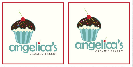
The first is in the design of your sign. If you mathematically center text or a logo in your sign design, you'll notice that your information will seem a bit low. This can easily be corrected by nudging the design slightly higher within the boundaries of the layout. Take a look at the example to the right.
Notice how the design on the left appears to be slightly off center? However, the design on the left is perfectly centered, while the company logo on the sign to the right it falls at the optical center.
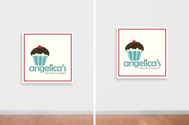
The second way the theory of optical centering can be applied to your signage is in the installation of your sign. In our 25 years of experience in the sign industry, we have observed that when a sign is mathematically centered precisely and vertically on a wall, it looks a little low. Again, the simple solution is simply to nudge the sign upwards to correct this visual anomaly.
In the example below, do you see how the installed sign looks a little low? A small adjustment can make a big difference visually.
Return to Contents
Get a Quote Today!


